Hospital Waitlist Analysis
Project Information
- Category: Data Analytics / Business Intelligence / Healthcare
- Client: Personal Project
- Project Date: March 2024
- Tools Used: Power BI, Microsoft Excel
- Data Source: Publicly Available Healthcare Dataset (2018-2021)
- Project URL: View live Dashboard
Healthcare Patient Waiting List Analysis
Summary
This report details my data analysis project, where I focused on understanding and optimizing patient waiting lists within a healthcare setting. Utilizing a publicly available dataset from 2018 to 2021, my core objective was to transform raw waiting list data into actionable insights that could improve resource allocation, enhance patient satisfaction, and enable more proactive planning. Through detailed analysis and interactive Power BI dashboards, I illuminated key metrics such as average median waiting times and current total waitlists. I also provided granular breakdowns by patient category (Inpatient vs. Outpatient), specialty, and age profile. My findings aim to empower healthcare administrators to make data-driven decisions that alleviate pressure on services and enhance overall operational efficiency.
1. Introduction
Long patient waiting lists are a pervasive and critical challenge within healthcare systems worldwide. They not only directly impact patient outcomes, increasing anxiety and potentially delaying essential care, but also strain operational efficiency and contribute to reduced patient satisfaction. Without robust systems for tracking and analyzing these wait times, healthcare providers operate at a disadvantage, struggling to understand historical trends, identify bottlenecks, and strategically allocate scarce resources.
For this project, I addressed this challenge by analyzing a publicly available dataset on healthcare patient waiting lists. My focus was specifically on two distinct categories of patients:
- Inpatients: Patients who are admitted and stay in a hospital for treatment.
- Outpatients: Patients who receive medical treatment without requiring hospital admission.
By dissecting the dynamics of waitlists for both categories, my analysis aimed to provide a holistic view of the demand for healthcare services and pinpoint areas ripe for intervention.
2. Project Objectives & Goals
I structured this project around clear objectives and actionable goals, designed to provide a comprehensive understanding of the patient waiting list landscape:
Overall Objectives:
- To track the current status of patient waiting lists: My goal was to provide an up-to-date snapshot of the total number of patients awaiting treatment at any given time.
- To analyze historical monthly trends: I aimed to identify significant patterns, seasonal variations, and shifts in waitlist numbers over time for both Inpatient and Outpatient categories.
- To conduct detailed specialty-level and age profile analysis: My objective was to uncover specific medical specialties experiencing high demand and to understand how wait times are distributed across different patient age demographics.
Project Goals & Deliverables:
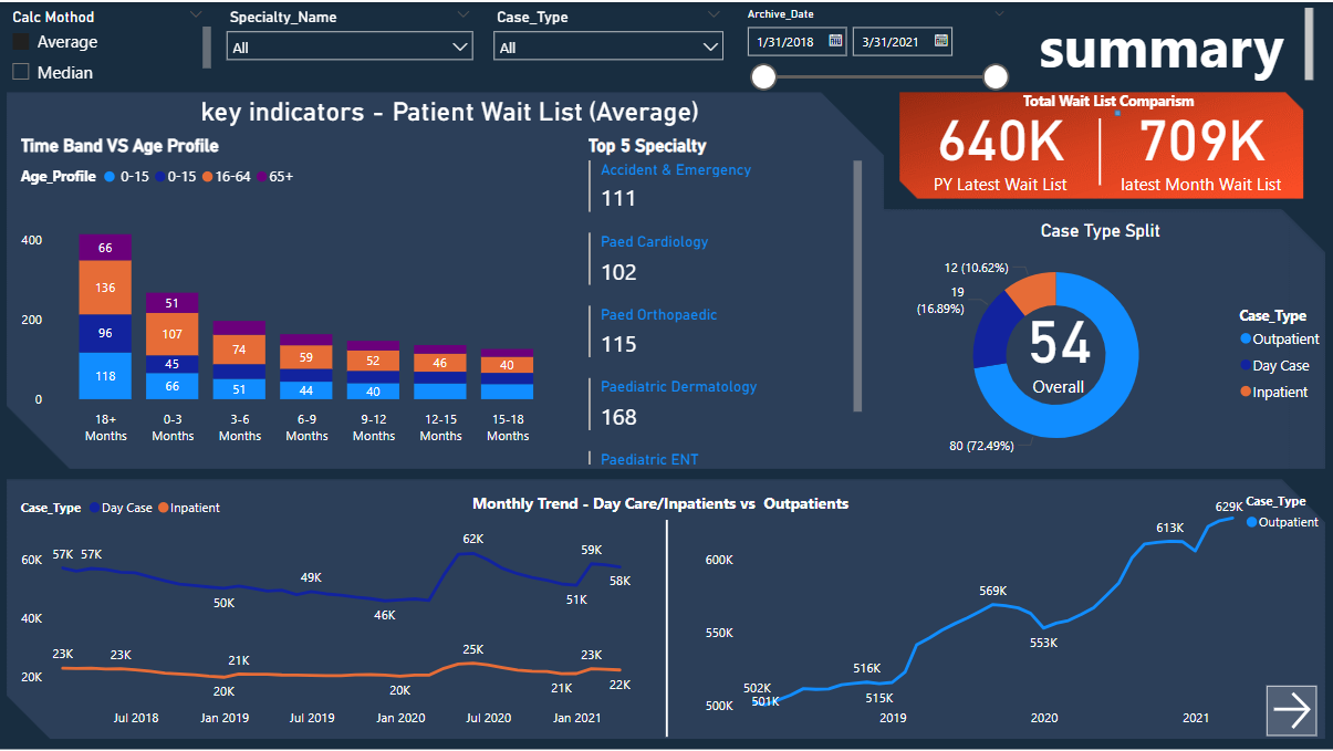
- Current Waitlist Tracking: I developed a robust system within the dashboard to accurately track and display the current total waiting list, offering an immediate, high-level overview of healthcare service demand. The dashboard clearly presents "Latest Month Wait List" (e.g., 640K patients) against a "PY Latest Wait List" (e.g., 709K patients), providing crucial comparison points that I found to be highly insightful.
- Historical Trend Analysis: I performed in-depth time-series analysis on monthly waitlist data from 2018-2021. The dashboard visually presents the "Monthly Trend - Day Care/Inpatients vs Outpatients," showcasing fluctuations and highlighting key periods of increase or decrease, such as the noticeable rise in Outpatient waitlists towards late 2020/early 2021. This trend analysis was vital for my forecasting.
- Granular Specialty & Age Profile Insights: I executed detailed analysis to segment waitlists by medical specialty and patient age groups. The dashboard's "Time Band VS Age Profile (Average)" chart visually represents wait times across different age demographics (0-15, 16-64, 65+) and time bands (e.g., 18+ Months, 0-3 Months), while the "Top 5 Specialty" section immediately identifies specialties like "Paediatric Dermatology" (168) and "Paediatric ENT" (148), with high average waitlists, enabling targeted resource allocation, which was a key output of my analysis.
3. Data Scope & Metrics
My analysis was conducted on a publicly available healthcare dataset covering the period from 2018 to 2021. This four-year historical window provided ample data for me to identify trends, understand seasonality, and assess the long-term evolution of patient waiting lists.
Key Metrics & Insights Derived:
- Average Median Waiting List: I calculated and visualized this metric to provide a representative measure of the typical waiting duration for patients. I chose this metric as it offers a more robust central tendency measure than the mean when dealing with potentially skewed waiting time distributions.
- Current Total Wait List: A critical operational metric providing the immediate number of patients currently on the waiting list. I prominently displayed this figure on the dashboard, alongside a comparison to previous periods, which I believe adds significant value.
- Case Type Split: The dashboard clearly quantifies the distribution of the overall waitlist by case type, highlighting that Outpatients constitute a significant majority (e.g., 72.49%), followed by Day Cases (e.g., 16.89%) and Inpatients (e.g., 10.62%). This breakdown was crucial for my understanding of demand.
4. Dashboard Design & Key Insights (Based on Visual Analysis)
My project culminated in the creation of intuitive and informative Power BI dashboards, which I structured to provide both a high-level overview and granular analytical capabilities.
4.1 Summary Page (Main Dashboard View)
The dashboard image displayed represents a well-designed summary page that I created, offering immediate insights into critical aspects of the patient waiting list:
- Header Filters: I included prominent filters for "Calc Method" (Average, Median), "Specialty Name" (All), "Case Type" (All), and "Archive Date" (1/31/2018 - 3/31/2021), indicating user interactivity and the ability to drill down.
- Key Indicators - Patient Wait List (Average):
- Total Wait List Comparison: I ensured this section clearly displays the "Latest Month Wait List" (640K) against the "PY Latest Wait List" (709K), providing an instant performance comparison.
- Case Type Split: I used a doughnut chart to vividly illustrate that Outpatient cases dominate the overall waitlist (72.49%), followed by Day Cases (16.89%) and Inpatients (10.62%). This was a crucial insight for my resource planning recommendations.
- Time Band VS Age Profile (Average): I designed a stacked bar chart to provide a detailed breakdown of average waitlist numbers across various age profiles (0-15, 16-64, 65+) and time bands (e.g., 18+ Months, 0-3 Months). This allowed me to identify age groups disproportionately affected by longer waits. For example, I observed the 16-64 age group showing a notable number in the "18+ Months" waiting band.
- Top 5 Specialty: I included a concise list to highlight the specialties with the highest average waitlist numbers, such as "Paediatric Dermatology" (168) and "Paediatric ENT" (148), indicating areas of significant demand.
- Monthly Trend - Day Care/Inpatients vs Outpatients: I used a line chart to effectively visualize the temporal trends for these categories. It clearly shows a generally stable trend for Inpatients and Day Cases, while Outpatient waitlists demonstrate a significant increase, particularly from late 2019 through 2020 into 2021, reaching 629K. This trend analysis was vital for my forecasting efforts.
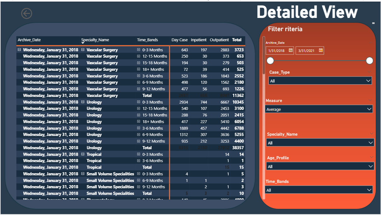
4.2 Detailed Page for Granular Analysis
My project's goal included developing a "Detailed Page for Granular Analysis." This page would feature:
- Further drill-down capabilities on specialties, allowing users to select a specific specialty and view its waitlist distribution across age, time bands, and monthly trends.
- More in-depth analysis of patient demographics or specific types of procedures contributing to wait times within each category (Inpatient/Outpatient).
- Potentially showing raw data or specific patient-level details (anonymized) to support operational decision-making.
5. Technical Approach & Tools
I developed this project by following a structured data analysis pipeline:
- Data Cleaning & Preprocessing: The initial phase involved ingesting the raw publicly available dataset. This included meticulous cleaning to handle missing values, correct inconsistencies, and ensure data integrity. I performed data transformations to prepare the dataset for effective analysis and visualization.
- Exploratory Data Analysis (EDA): I conducted extensive EDA to understand the underlying structure, distributions, and initial patterns within the waiting list data. This involved statistical summaries and preliminary visualizations to formulate hypotheses and identify key areas for deeper investigation.
- Data Modeling & Visualization (Power BI): The core of my project's analytical delivery was built using Power BI. I leveraged this powerful business intelligence tool for:
- Data Modeling: Establishing relationships between different data tables to create a robust and flexible data model.
- DAX (Data Analysis Expressions) Calculations: Developing custom measures and calculated columns to derive key metrics such as "Average Median Waiting List" and enable complex comparisons like "Total Wait List Comparison."
- Interactive Dashboard Creation: Designing visually appealing and interactive dashboards, as exemplified by the summary page, allowing users to filter, drill down, and explore data dynamically to uncover insights tailored to their specific needs.
6. Impact & Business Value
I believe this "Healthcare Patient Waiting List Analysis" project delivers significant value to healthcare administrators and policymakers by providing:
- Optimized Resource Allocation: By clearly identifying high-demand specialties and understanding the distribution of wait times across different age groups, the insights I generated enable strategic allocation of resources (staff, beds, equipment) to areas most in need, thereby reducing bottlenecks.
- Improved Patient Experience: Understanding the factors contributing to long wait times allows for the development of targeted interventions aimed at shortening queues and improving patient flow, ultimately enhancing overall patient satisfaction and trust in the healthcare system.
- Proactive Planning: The historical trend analysis provides a solid foundation for forecasting future demand. This enables healthcare facilities to anticipate increases in patient volume and proactively plan for staffing, infrastructure, and policy adjustments, preventing the accumulation of large backlogs.
- Data-Driven Decision Making: The project equips stakeholders with objective, evidence-based insights derived from real data. This shifts decision-making from intuition to a more informed, strategic approach for operational improvements, policy formulation, and long-term healthcare planning.
7. Conclusion
By successfully transforming complex, raw healthcare waiting list data into clear, interactive, and actionable insights, this project demonstrates my strong command of data analysis principles, robust technical skills in Power BI, and a keen understanding of real-world healthcare challenges. The resulting dashboards serve as a powerful tool for monitoring, analyzing, and ultimately improving patient access to care, underscoring the critical role of data in modern healthcare management.